The Buffalo Sabres are one of the most storied franchises in the NHL, with a rich history that includes unforgettable players, thrilling games, and iconic logos. Among these, the Buffalo Sabres Goat Head logo stands out as a symbol of grit, passion, and a unique era in the team’s history. From its introduction in the 1990s to its triumphant return in recent years, the Goat Head logo has become a beloved emblem for Sabres fans. In this blog post, we’ll dive into the history, design, and cultural impact of the Sabres Goat Head logo, exploring why it continues to resonate with fans today.
1. The History of the Goat Head Logo
Origins: A Bold New Identity
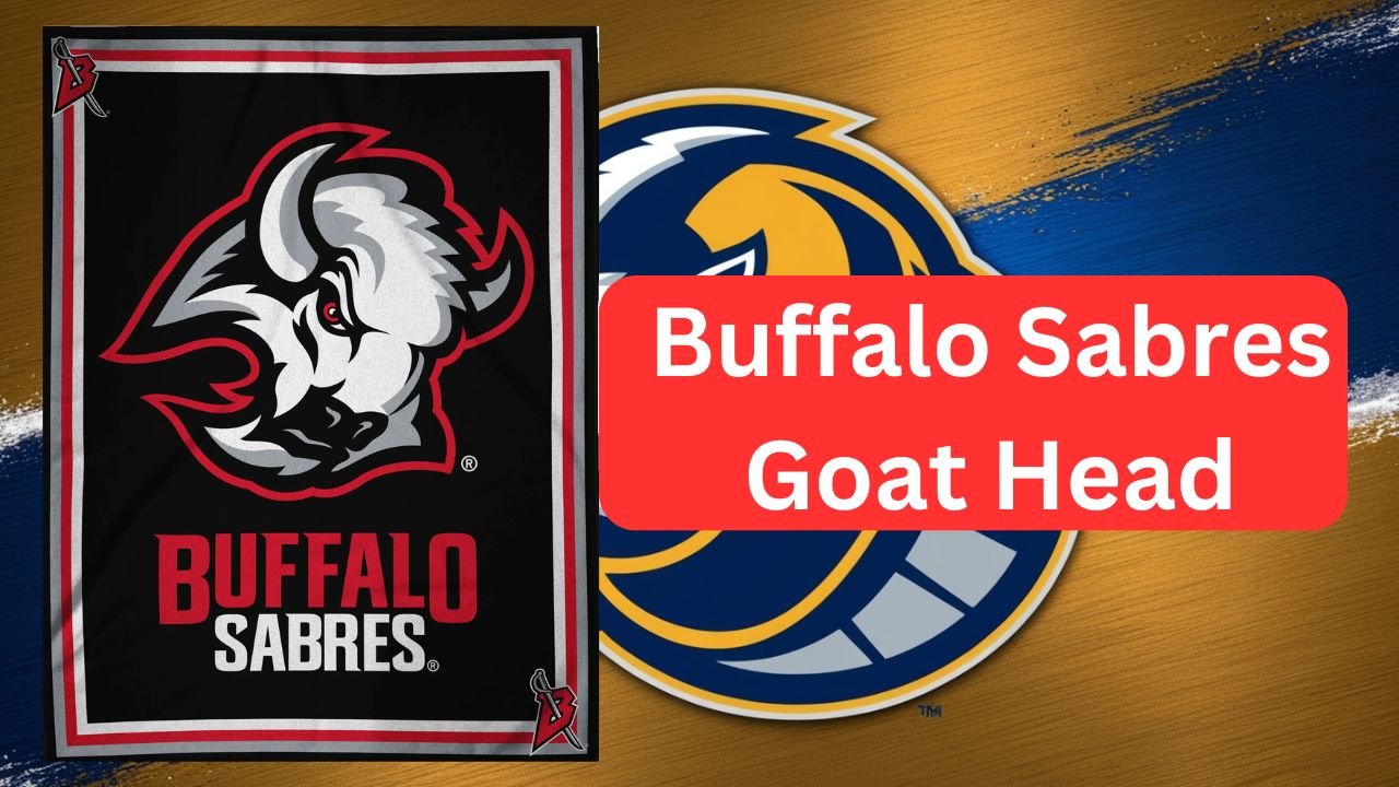
The Buffalo Sabres Goat Head logo was introduced in 1996, marking a significant shift in the team’s branding. The original Sabres logo, featuring a blue-and-gold bison, had been a staple since the team’s inception in 1970. However, by the mid-1990s, the franchise sought a fresh, modern look to reflect a new era of hockey. The result was the Goat Head logo, a fierce red-and-black bison head with sharp, menacing horns.
Design Inspiration: A Fierce New Look
The Goat Head logo was designed to evoke strength and aggression, perfectly capturing the spirit of the game. The bold red-and-black color scheme was a departure from the traditional blue and gold, giving the team a more intimidating presence on the ice. The logo’s sharp lines and angular design made it stand out, and it quickly became a fan favorite.
Replacement of the Original Logo
The decision to replace the original logo was not without controversy. Some fans were attached to the classic bison design, while others embraced the change as a sign of progress. The Goat Head logo represented a new chapter for the Sabres, one that would be defined by memorable players and thrilling moments.
2. The Design and Symbolism
Visual Breakdown: A Closer Look
The Goat Head logo features a stylized bison head with exaggerated horns, giving it a distinctive, almost mythical appearance. The red-and-black color scheme is bold and eye-catching, while the angular design adds a sense of motion and energy. The logo’s fierce expression perfectly encapsulates the intensity of hockey.
Symbolism: Strength and Identity
For many fans, the Goat Head logo symbolizes strength, resilience, and a never-say-die attitude. It became a representation of Buffalo’s hardworking, blue-collar identity, resonating deeply with the city’s passionate fanbase. The logo’s aggressive design also reflected the team’s playing style during the late 1990s and early 2000s.
Fan Reception: From Skepticism to Love
When the Goat Head logo was first introduced, reactions were mixed. Some fans were skeptical of the bold new design, while others immediately embraced it. Over time, however, the logo grew on fans, becoming a beloved symbol of the team’s identity. Today, it’s celebrated as one of the most iconic logos in NHL history.
3. The Goat Head Era: Memorable Moments
Key Players and Teams
The Goat Head era was defined by some of the most talented players in Sabres history. Hall of Fame goaltender Dominik Hašek was a standout during this period, earning the nickname “The Dominator” for his incredible performances. Forward Miroslav Šatan also made a significant impact, becoming one of the team’s top scorers. Together, these players helped the Sabres achieve success during the late 1990s and early 2000s.
Playoff Runs and Achievements
The Goat Head era saw the Sabres make several deep playoff runs, including a trip to the Stanley Cup Finals in 1999. Although the team fell short of winning the championship, these moments remain some of the most memorable in franchise history. The Goat Head logo became synonymous with this period of success, further cementing its place in Sabres lore.
Cultural Impact: A Symbol of Buffalo
Beyond hockey, the Goat Head logo became a symbol of Buffalo’s gritty, hardworking identity. It represented the city’s resilience and determination, qualities that resonated with fans both on and off the ice. The logo’s popularity extended beyond the rink, appearing on merchandise, apparel, and even local murals.
4. The Return of the Goat Head
Fan Demand: A Nostalgic Comeback
For years, fans campaigned for the return of the Goat Head logo, longing for the nostalgia and excitement it brought. Their efforts paid off in 2020 when the Sabres announced that the Goat Head logo would return as an alternate jersey. The announcement was met with widespread enthusiasm, as fans eagerly awaited the chance to see the iconic logo back on the ice.
Reintroduction: A Modern Twist
The reintroduction of the Goat Head logo in 2020 was a nod to the team’s history while also embracing modern design trends. The new jerseys featured the classic red-and-black color scheme, with subtle updates to the logo’s design. The return of the Goat Head jersey was a hit with fans, quickly becoming one of the most popular items in the Sabres’ merchandise lineup.
Modern Reception: A New Generation of Fans
The return of the Goat Head logo has introduced a new generation of fans to its iconic design. Younger fans who never experienced the original Goat Head era have embraced the logo, while longtime fans have relived the nostalgia of the 1990s and early 2000s. The logo’s enduring appeal is a testament to its timeless design and cultural significance.
5. Why the Goat Head Logo Endures
Nostalgia: A Connection to the Past
For many fans, the Goat Head logo is a reminder of a specific era in Sabres history, one filled with unforgettable moments and legendary players. Its return has allowed fans to reconnect with those memories, making it a powerful symbol of nostalgia.
Unique Identity: Standing Out in the NHL
The Goat Head logo is unlike any other in the NHL, with its bold design and fierce expression. It stands out as a unique representation of the Sabres’ identity, setting the team apart from its rivals.
Merchandise and Popularity: A Fan Favorite
The Goat Head logo remains one of the most popular designs in Sabres merchandise. From jerseys to hats to posters, fans can’t get enough of the iconic logo. Its continued success in merchandise sales is a testament to its enduring appeal.
6. The Future of the Goat Head
A Permanent Part of the Sabres’ Identity?
As the Goat Head logo continues to resonate with fans, many wonder if it will become a permanent part of the Sabres’ branding. While the team’s primary logo remains the classic blue-and-gold bison, the Goat Head logo has proven its staying power as an alternate design.
Potential Role in Future Rebranding
The success of the Goat Head logo could influence future rebranding efforts for the Sabres. Its bold design and cultural significance make it a strong candidate for a more prominent role in the team’s identity.
Conclusion
The Buffalo Sabres Goat Head logo is more than just a design—it’s a symbol of an era, a connection to the past, and a source of pride for fans. From its introduction in the 1990s to its triumphant return in recent years, the Goat Head logo has left an indelible mark on the Sabres’ legacy. Whether you’re a longtime fan or new to the team, the Goat Head logo is a reminder of what makes the Sabres special.
What’s your favourite Goat Head memory? Share your thoughts in the comments below, or grab your own Goat Head jersey to show your support for the Buffalo Sabres!
Read More
More Latest News on USA Blog Orbit.
1. Official Buffalo Sabres Website
- Link: https://www.nhl.com/sabres
- Purpose: To provide readers with official information about the team, including current news, schedules, and merchandise.
2. NHL History of Team Logos
- Link: https://www.nhl.com/news/nhl-team-logos-through-the-years
- Purpose: To give readers a broader context of how the Sabres’ Goat Head logo fits into NHL logo history.
3. Dominik Hašek’s Hall of Fame Profile
- Link: https://www.hhof.com/honouredmembers/players/dominik-hasek.html
- Purpose: To highlight the career of Dominik Hašek, a key player during the Goat Head era.
4. Miroslav Šatan’s Career Stats
- Link: https://www.hockey-reference.com/players/s/satanmi01.html
- Purpose: To provide detailed statistics and achievements of Miroslav Šatan, another star of the Goat Head era.
5. NHL Reverse Retro Jerseys Article
- Link: https://www.nhl.com/news/nhl-reverse-retro-jerseys-for-2022-23/c-337044848
- Purpose: To discuss the NHL’s Reverse Retro program, which included the Sabres’ Goat Head jersey.
6. Buffalo Sabres Merchandise Store
- Link: https://shop.nhl.com/buffalo-sabres/t-36715346+z-954816-4262848636
- Purpose: To direct readers to official Sabres merchandise, including Goat Head jerseys and apparel.
7. Fan Reactions to Goat Head Return
- Link: https://www.diebytheblade.com/2020/11/16/21566944/buffalo-sabres-goat-head-jersey-return-fan-reactions
- Purpose: To showcase fan reactions and nostalgia surrounding the return of the Goat Head logo.
8. History of Buffalo Sports Teams
- Link: https://www.buffalohistory.org/sports
- Purpose: To provide historical context about Buffalo’s sports culture and the Sabres’ place within it.
9. NHL Logo Rankings
- Link: https://bleacherreport.com/articles/2850918-ranking-all-31-nhl-team-logos
- Purpose: To offer an external perspective on how the Sabres’ Goat Head logo ranks among other NHL logos.
10. Buffalo Sabres Goat Head Jersey Release News
- Link: https://www.sportslogos.net/news/2020/11/16/buffalo-sabres-bring-back-goat-head-jersey-as-new-alternate/
- Purpose: To provide details about the official announcement and release of the Goat Head jersey in 2020.
11. Buffalo Sabres Fan Culture
- Link: https://www.buffalorumblings.com/
- Purpose: To highlight the passionate fan culture surrounding the Sabres and their iconic logos.
12. High-Resolution Goat Head Logo Image
- Link: https://www.sportslogos.net/logos/view/4576/Buffalo_Sabres/1996/Alternate_Logo
- Purpose: To provide readers with a high-quality image of the Goat Head logo for reference.